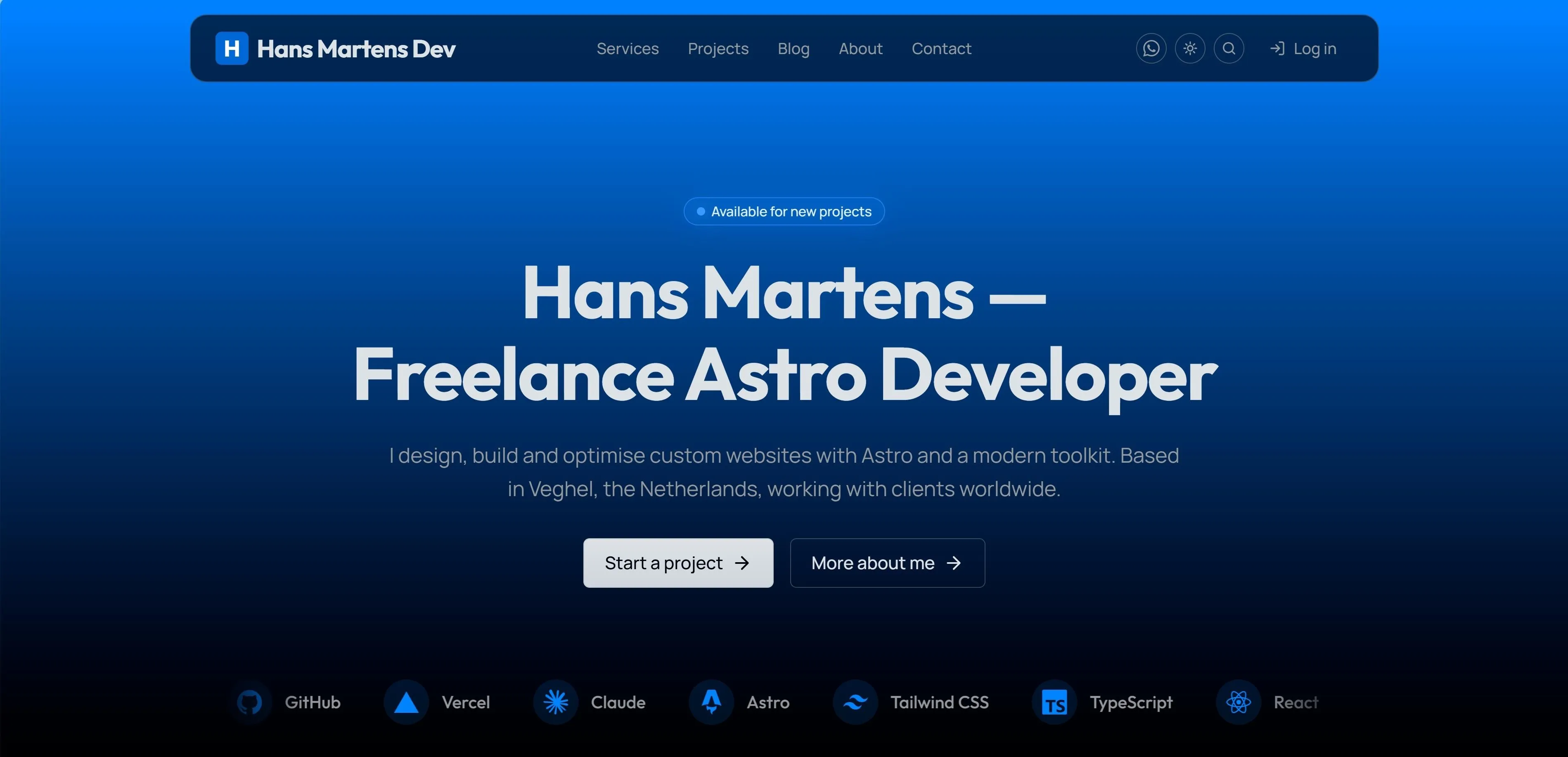
The site you’re standing on
This is my own portfolio — the home for my work, my writing, and the experiments that get tried out before any of it reaches a client — and it’s the one site where I’m building entirely for myself.
It’s also more than a brochure. Behind the Login button in the header sits a working client portal: my clients sign in — without a password — and see their invoices, live from my bookkeeping. More on that in a moment, because it’s the part of this site I use every working day.
What makes this project worth writing up isn’t a logo or a colour. It’s where it came from. The whole thing is built on Astro Rocket — the open-source Astro 7 starter I built and released.
I built the starter. Then I used the starter to build the site you’re reading this on.
A real client portal, wired into my bookkeeping
The newest part of the site is the one you can’t fully see: a client portal at the end of that Login button. Clients sign in and get a dashboard with their outstanding balance, their active projects, and their invoices — each one downloadable as the official PDF. No “please find attached” emails, no asking me to resend something: the latest state of their account, whenever they want it.
The portal doesn’t keep its own records. It’s wired directly into Moneybird, the Dutch bookkeeping platform where my actual administration lives. That one decision shaped everything else about the build.
The front door is public, by the way — take a look at the sign-in page. Without an email address that’s in my books it politely goes nowhere, but you’ll see exactly what my clients see.
Signing in without passwords
There are no passwords anywhere in this system — none to choose, store, reset, or leak. A client types the email address their invoices are sent to, and a serverless function checks it against my contacts in Moneybird. If it matches, Resend — the same service that powers the contact form — emails them a sign-in link that’s valid for fifteen minutes. Clicking it opens a session that lasts thirty days, carried in a signed, httpOnly cookie.
The quiet detail I care about: the login form gives exactly the same answer whether an address is registered or not, so nobody can use it to probe who my clients are. A hidden honeypot field soaks up the spam bots, and every portal page tells search engines to stay out.
Moneybird stays the single source of truth
The portal has no database. Nothing is copied, nothing is synced, nothing can go stale. Every time a client opens their dashboard, the site asks the Moneybird API for the current state of their invoices — open, paid, late — and renders exactly that. Draft invoices are filtered out before they ever reach a response, and every request is checked against the signed-in contact, so a client can only ever see documents that belong to them.
Even the PDF download is a pass-through: the file streams from Moneybird through the server to the browser, so my API token never leaves the backend and no public URL to any invoice exists. And that token is deliberately weak on purpose — read-only, scoped to sales invoices alone. Even in the worst case it could only ever look at invoices, never touch the books.
Three settings on Vercel
The entire live/demo behaviour of the portal hangs on three environment variables in the Vercel dashboard — no config files, no code changes:
MONEYBIRD_API_TOKEN— the read-only personal access token, created in Moneybird with only the sales-invoices scope ticked.MONEYBIRD_ADMINISTRATION_ID— which administration to read, the long number from the Moneybird URL.PORTAL_SESSION_SECRET— a long random string that signs every sign-in link and session cookie. Rotate it and every session on earth is instantly invalid: the emergency brake.
(The fourth variable involved, RESEND_API_KEY, was already there for the contact form.)
The part I like most: without those variables, the portal doesn’t break — it demos. While I was building and the bookkeeping wasn’t connected yet, the same pages served a fictional client with fictional invoices behind a one-click sign-in, clearly labelled as demo data. The day Moneybird was ready, I added the three variables, redeployed, and the demo retired itself: same code, now serving real invoices with real sign-in. Remove the variables and it would fall straight back to the demo. Going live was a settings change, not a release.
How it all fits together
End to end, a sign-in travels like this:
- A client clicks Login in the header and lands on the portal’s sign-in page.
- They enter their invoice email; an Astro server endpoint on Vercel matches it against my Moneybird contacts.
- Resend delivers a signed link — valid for fifteen minutes, useless after that.
- The link sets a signed cookie: a thirty-day session, no account record created anywhere.
- From then on, middleware guards every portal route; each page pulls that client’s invoices and projects live from the Moneybird API at the moment it renders.
- PDFs stream through the same guarded channel, straight out of the bookkeeping.
Astro renders it, Vercel runs it, Resend delivers it, Moneybird remembers it. The site itself stores nothing at all — which means there’s nothing to back up, nothing to migrate, and nothing to breach.
Built on my own Astro Rocket theme
This site is built on Astro Rocket, my own open-source Astro 7 theme. The design system, components, SEO stack, contact form, colour-mode system, and animation layer all come from there — a finished foundation I could build straight on top of.
A short site, built properly
The map is deliberately small. There’s a homepage, a Services page, a Projects page (you’re inside one of its cards right now), a Blog, and a Contact page — plus an About page where I tell the longer story. Five public destinations and a bit of backstory — and one members-only door: the client portal behind the Login button, which only opens for the people whose invoices live inside. No filler routes padded in just to make the navigation look busy.
Two heroes, four moods
The hero is where the brand has to land, so it gets two completely different treatments depending on the page.
The homepage hero is locked. It’s a single vertical wash of colour — brand blue at the top, sinking down to true black at the foot — and it renders identically whether your machine is set to light or dark. That’s on purpose. The first screen is the brand’s one chance to make an impression, and I didn’t want the OS preference quietly changing the mood of my front door. The headline sits in a soft, brand-tinted near-white so it never shouts over the gradient, and the floating capsule rests on top like frosted glass. And riding low at its foot — where a scroll cue would normally sit — a single row of brand-tinted tech logos glides quietly past: the tech-stack marquee, which I recently moved up into the hero itself. More on that below.
The inner pages take the opposite approach — and this is my favourite trick on the whole site. Services, Projects, Blog, About and Contact share a quieter hero that deliberately flips its technique with the colour mode, both versions pure CSS that cost nothing on performance:
- In light mode, a faint architectural grid sits behind the heading — 56px cells, like pale blueprint paper, brightest just under the header and dissolving out to plain white at the corners, with the lines subtly lighting up in brand blue toward the centre.
- In dark mode, the grid gives way to a beam — a soft pool of brand light spilling down from the top edge, as if it’s falling from the underside of the fixed header, fading out before it reaches the headline so the title stays crisp on the dark.
In light mode the structure is drawn in lines; in dark mode it’s painted in light. Same anchor, same brand colour, two opposite moods from one idea.
System, Light, Dark — your call, not mine
The colour-mode control in the header is a real three-state switch, not a binary toggle. You can pin Light, pin Dark, or choose System and hand the decision to your operating system. And when System is active, the site tracks your OS live — change your Mac or Windows preference and the page flips the instant you do, no reload. Your choice is remembered across reloads and new tabs, and the icon in the pill always shows what you picked, never just what happens to be on screen.
The detail I’m quietly proud of: there’s never a flash of the wrong theme. A tiny script runs in the page head before the body paints, reads your saved preference, and applies dark mode up front — so a dark-mode visitor never catches a single white frame, not on first load and not when moving between pages. I wrote the whole thing up in System, Light, Dark — How the Colour-Mode System Works.
One restraint worth mentioning: Astro Rocket can offer twelve switchable accent colours, but on this site I’ve turned that off. Blue is the brand. The dial still works underneath — I’ve just locked it, because my own portfolio shouldn’t be inviting you to redecorate it.
The stack, gliding past — in two places
The tools I build with show up twice on the site, both times as a gliding marquee — and the two are deliberately different animals.
In the homepage hero. The newer one rides low at the foot of the opening gradient, where a scroll cue would normally sit: a single brand-tinted row of the seven core logos — Astro, Tailwind, TypeScript, React, GitHub, Vercel, and Claude — drifting gently across on a loop. It’s purely decorative — it doesn’t pause and the cards don’t link out, so it can never compete with the headline or hijack a tap on the way to the buttons. It shows on tablets and desktops; phones don’t get the scrolling version, and portrait phones get a calm, static row of the four core logos in its place.
On the About page. There used to be a second marquee down near the foot of the homepage — a fuller, double-row strip of the whole stack. Rather than retire it when the hero version arrived, I gave it a new home on the About page, where it’s taken over the “Tools & Tech / My Stack” section: on tablets and desktops the old card grid is now that double row of logos scrolling in opposite directions, while phones keep the original cards exactly as they were. This one’s the interactive cousin — hover a card and its row pauses, and each logo links straight out to that tool’s own site.
Both are tinted in the site’s brand blue rather than each tool’s own colour, so they read as one deliberate band and re-tint with the colour mode; and like everything here that earns its keep, each is pure CSS on a duplicated track — a continuous scroll that ships zero JavaScript and never touches the main thread. I wrote up the whole build — including why I solved it twice over, once for this site and once for Astro Rocket, where the same marquee can sit in the hero, run as a standalone homepage section, or both — in How I Built a Tech-Stack Marquee as an Astro Developer.
The CTA you keep scrolling back to
Every page that wants to convert ends on the same closing note: a contained band with the LetterGlitch effect running behind it — a field of brand-blue characters flickering and cycling on a canvas — with a brand-tinted glass card floating on top to keep the headline and buttons perfectly readable. There’s a soft halo bleeding out behind the rounded band so it feels like it’s glowing rather than just sitting there.
It’s intentionally a desktop moment. On a phone the band would squeeze into something tense and unreadable, so small screens get a calm, flat version of the same call-to-action instead — same words, same buttons, no canvas. It’s a little flourish of texture in an otherwise restrained layout, and that contrast is exactly why it works. The full build, component and all, is in Add a LetterGlitch Effect to Your Astro 7 Site.
Motion with manners
Nothing on this site moves to show off. The animation layer is there to make things feel like they arrive rather than just appear:
- A spring, not an ease. Entrances ride a
cubic-beziercurve tuned to overshoot a few pixels and settle back, so elements land with a tiny bounce instead of stopping dead. It feels like a physics spring — but it’s pure CSS, no animation library shipped to your browser. - Things reveal as you reach them. Sections fade and lift into place as they scroll into view; grids of cards cascade in one after another instead of all at once.
- A cursor that leaves a trail. On desktop, a brand-blue dot tracks your pointer, a soft ring chases it and blooms over anything clickable, and a comet of fading particles follows fast movements.
- A reading progress ring. A thin arc draws itself clockwise around the back-to-top button as you move down a page — empty at the top, a full circle at the bottom.
- A headline that types itself without ever shifting the layout around it, because the line is pre-measured to its longest phrase before the animation starts.
And the rule that ties it all together: if you’ve set prefers-reduced-motion, the whole layer steps aside. Entrances become instant, the cursor trail never spawns, the typing effect falls back to static text. Motion is a treat for people who want it, never a tax on people who don’t. The full breakdown lives in Animations in Astro Rocket.
Never losing your place
Long reads on this site — both the blog posts and the project pages like this one — get an automatic table of contents, generated straight from the headings. On a wide screen it pins itself to the side and quietly highlights the section you’re currently in as you scroll; on narrower screens it tucks away so it never crowds the reading column.
If your window is wide enough, that list of every heading on this page is sitting beside you right now, tracking where you are. It’s a small thing that makes a long page feel navigable instead of endless. I covered how it’s built — and the layout options — in Table of Contents — Reading Anchors for Long Posts.
The contact page
The contact page is built to make starting a conversation effortless, so it’s split into two halves.
On the left is the project form — a card headed “Project details” with a handful of fields and a single Send. Behind it, it’s properly wired: schema validation so bad input is caught before it’s sent, a hidden honeypot to quietly soak up spam bots, and a Resend-powered handler that drops the message straight into my inbox. The promise next to it is one I keep: a reply within one business day.
On the right is a column of other channels for people who’d rather not fill in a form — direct email and my social links as tidy little cards, a card showing where I’m based, and my business registration details for anyone who needs them. Wiring that form up to actually deliver real email — Resend, the domain, the one environment variable on Vercel, and the GoDaddy DNS records — is the kind of thing that trips people up, so I documented every step in Contact Form Setup: Resend, Vercel, and GoDaddy Step by Step.
Lighthouse score
Here’s the number I’m proudest of. This site scores 100 on every Lighthouse category — Performance, Accessibility, Best Practices, and SEO — on both mobile and desktop. A clean sweep, four out of four, on the full site: animations, theme switcher, typed headline, contact form, cursor trail, LetterGlitch and all.
That score isn’t a trick page tuned for the test. It’s the by-product of decisions made the whole way through — shipping zero JavaScript on pages that don’t need it, deferring layout reads so nothing janks, running every image through a proper pipeline, and meeting contrast and keyboard requirements by default rather than as an afterthought. Every new feature gets weighed against its Lighthouse cost before it ships; that’s literally why the LetterGlitch band stays desktop-only, and why the stack marquee in the hero bows out on phones. If you want the plain-language version of what those four numbers actually measure, I wrote What the Lighthouse Score Actually Means.
I’m proud of this one
I don’t say that lightly about my own work. But this is the rare project where the design, the code, the performance, and the foundation all came together exactly the way I pictured them — a site that’s fast, accessible, genuinely mine, built on a starter I’m happy to put my name on twice, and now earning its keep as the front door to my actual business, invoices and all.
From here, this is where the new work shows up first. New features, new experiments, new writing — they land on this site before anything else. Some of it gets folded back into Astro Rocket; some of it stays here because it only makes sense in context. Either way, if you want to see what I’m building next, you’re already in the right place.