What it is
Astro Rocket is my own free, open-source theme, built on Astro 7 and Tailwind CSS v4. It isn’t a boilerplate you spend a week wiring up — it’s a finished website. Every page is already designed and built, so you change the text, pick a colour, and go live.
I made it for the people I know best: designers, freelancers, and developers who want a site that already looks finished on day one. It’s MIT-licensed, up on GitHub, and listed on the official Astro themes directory. The full thing runs live at astrorocket.dev — and the site you’re reading this on, Hans Martens Dev, is built on it too.
Perfect Lighthouse score
The whole point was a starter that scores 100 on all four Lighthouse categories — Performance, Accessibility, Best Practices, and SEO — out of the box, on both mobile and desktop. And not on a stripped-back demo page: the full site, with the animations, the theme switcher, the typed headline, and the contact form all running.
That score isn’t something I bolt on at the end. It comes from Astro shipping zero JavaScript by default and me refusing to undo that. If you want the plain-language version of what the four numbers mean, I wrote it up in the Lighthouse post.
Twelve themes, one click
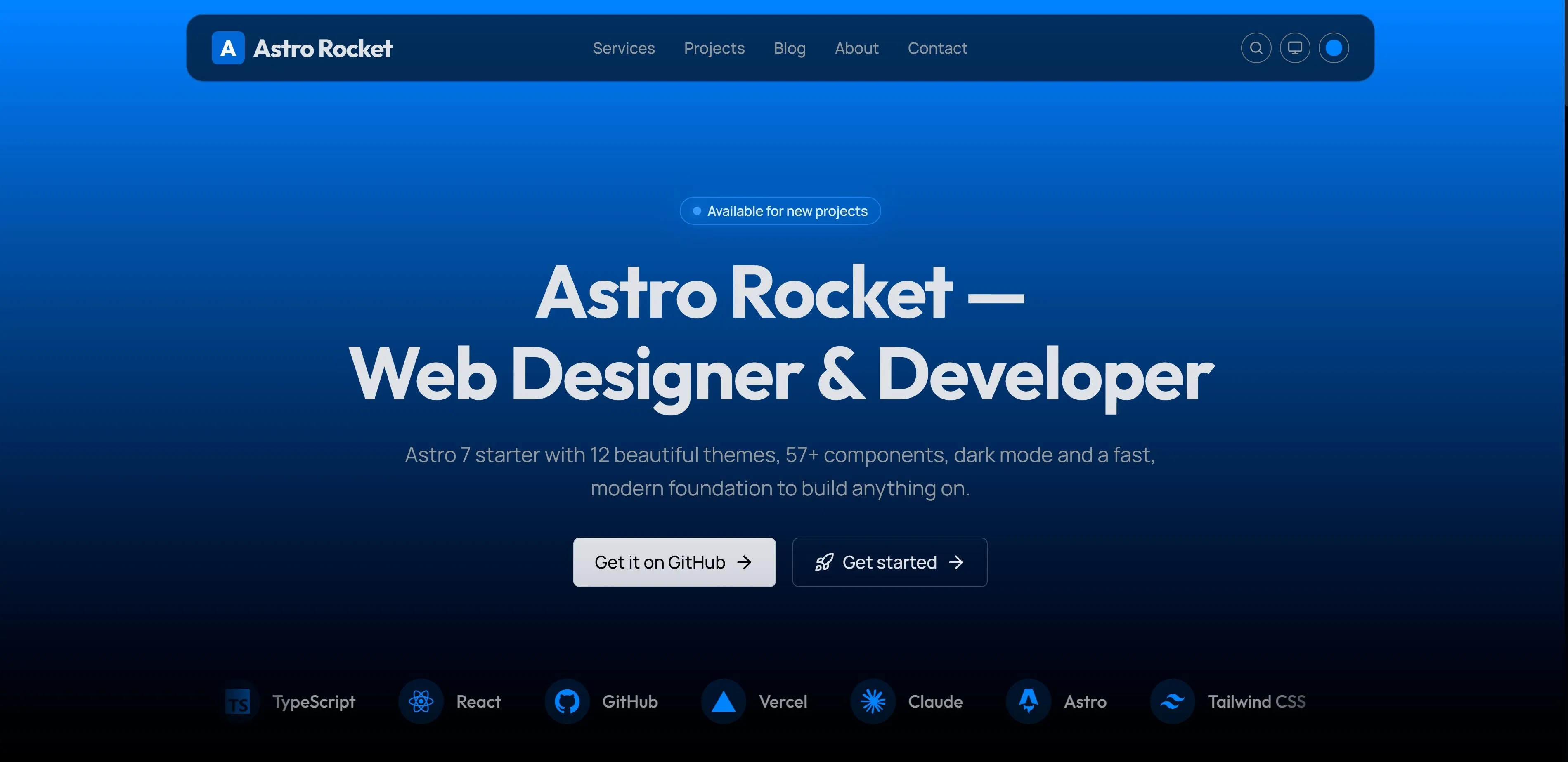
Astro Rocket ships twelve colour themes — Orange, Amber, Lime, Emerald, Teal, Cyan, Sky, Blue, Indigo, Violet, Purple, and Magenta. They sit as swatches in the header: click one and every brand colour on the page — buttons, links, the auto-generated logo badge, the blog-cover gradients — updates live, no rebuild. Blue is the default. Once you’ve settled on a colour, you can pull the selector out of the header and keep everything else.
Underneath it’s just CSS custom properties scoped to a data-theme attribute, so the browser does all the work and the server never has to think about it.
System, Light, Dark
Colour mode is a proper three-state control, not an on/off switch. You can pin Light or Dark, or choose System and let the visitor’s own machine decide — and under System it tracks the OS setting live, flipping the moment the OS does. The choice is saved between visits, and a small script runs in the page head before the first paint, so there’s never a flash of the wrong mode. The full write-up is in System, Light, Dark — How the Colour-Mode System Works.
The heroes
The heroes are the part I’m happiest with, and they behave differently depending on the page:
- The homepage hero is a single vertical gradient — the brand colour at the top, fading down to black. It looks the same in light and dark mode on purpose. The first screen is where the brand has to land, so I didn’t want the visitor’s OS quietly changing its mood. The headline types itself, and the line is measured up front so the layout never shifts while it does. New here: you can drop the tech-stack marquee right into the foot of this hero — one of the two homes it now ships in, covered just below.
- The inner pages — services, projects, blog, contact — share a quieter hero that flips with the colour mode. In light mode it’s a faint architectural line grid, like pale blueprint paper, brightest under the header and fading out to the page edges. In dark mode that grid gives way to a soft beam of brand light spilling down from beneath the header. Both are pure CSS — no JavaScript, and nothing for Lighthouse to pay for.
The stack marquee
A tech-stack marquee — a brand-tinted row of logo cards for the tools a site is built with — and Astro Rocket now ships it in two places, so you can decide what suits your homepage:
- Built into the homepage hero, gliding low across the foot of the opening gradient where a scroll cue would sit. It’s one quiet, decorative row: it doesn’t pause and the cards don’t link out, so it never competes with the headline or the call-to-action buttons.
- As a standalone section lower down, just above the closing call-to-action — the original placement, still here. This one pauses when you hover it, and on desktop each card links out to that tool’s own site.
Keep one, keep both, or strip either out — it’s your site, and both are wired the same way underneath. Every logo is tinted with the active brand colour rather than its own, so switching among the twelve themes re-tints both marquees along with everything else. Like the rest of Astro Rocket, each is a single CSS animation on a duplicated track: zero JavaScript, nothing for Lighthouse to pay for.
Both run on every device except mobile phones — tablets and desktops get them, while on phones they aren’t rendered, so there’s never a half-working animation squeezed onto a small screen. On touchscreens the standalone section’s cards are deliberately non-clickable, because on touch it’s far too easy to brush a moving card mid-scroll and get yanked off to an external site by accident.
I broke the component down line by line — the duplicated track, the pure-CSS loop, the touch handling — in The Stack Marquee — A Pure-CSS Infinite Tech Strip, and told the story of building it for both my own site and this theme in How I Built a Tech-Stack Marquee as an Astro Developer.
What’s in the box
The heart of the project is the component library — 57 components (33 UI, plus blog, landing, layout, pattern, and SEO pieces), every one typed with TypeScript, dark-mode aware, and built on a three-tier design-token system. Around that, the things a real portfolio or marketing site needs are already wired up:
- A full MDX blog with tags, RSS, an optional table of contents, and optional Giscus comments
- The complete SEO layer — JSON-LD, sitemap, robots, Open Graph, and a ready-made social image
- A working contact form and newsletter, both powered by Resend
- Pagefind static search, and 350+ Lucide plus 3,000+ Simple Icons through a single
Iconcomponent - Native, opt-in i18n — English and Dutch in the box, off until you want it
- A layered animation system — scroll reveals, a scroll-reactive header, animated counters, the typed headline — all of it respecting reduced motion
- Deploy configs for Vercel, Netlify, and Cloudflare, ready to push
Built on Velocity
Astro Rocket is a fork of Velocity by Southwell Media — a strong Astro boilerplate with a serious design system underneath it. Full credit to them for that foundation. I took it somewhere different: a complete, ready-to-launch site where the only thing standing between a clone and a live website is your own text.
Free, and on GitHub
This is the starting point I wish I’d had — already at 100 across the board, with the patterns I actually use built in. It’s free, it’s on GitHub, and if it saves you a week of setup, a star is the nicest way to say thanks.